BLUFF
Crypto-native casino, sportsbook, and prediction markets
Client
Company
BLUFF
Project Type
Casino · Sportsbook
Year
2025-2026
Crypto-native casino, sportsbook, and prediction markets
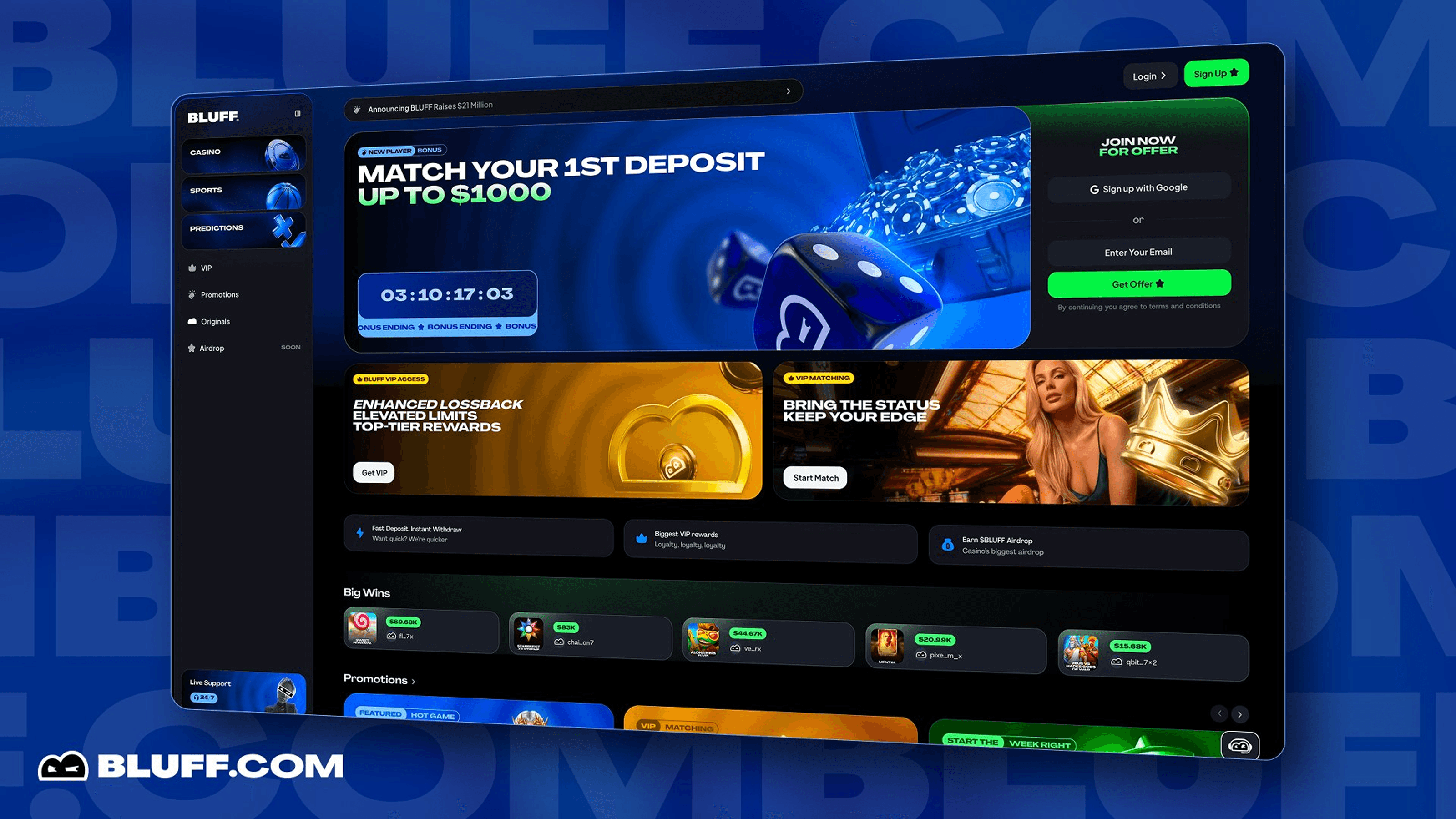
Bluff casino home - live
Fifteen months as Senior Product Designer on Bluff, a crypto-native casino and sportsbook backed by $21M from 1kx, Makers Fund, Maximum Frequency Ventures, and the founders of Delphi Ventures. Here's what I shipped during that time:
Including the Bluff exclusive Flappy Fortune.
15% registration-to-play, 12% on referred users.
Mapping more than two dozen distinct error conditions across email, phone, and OTP flows.
Designed around external API constraints.
On top of the Superduper Design System template.
Across three months of post-launch iteration.
Bluff is a casino, a sportsbook, prediction markets, and creator community events stacked into one crypto-native product. The team behind it includes operators from Stake, Bet365, William Hill, and Bodog, the people who actually built the casinos that Bluff is now competing with. Launch combined a Blink Points pre-launch campaign with a VIP migration program designed to pull high-value players from competing crypto casinos directly onto the platform.
Senior Product Designer on Bluff for about 15 months at Superduper, working with Tom Jones as design lead. The job wasn't really "design a casino UI", that's the easy way to describe it. The honest version is: onboarding, incentives, in-house games, sportsbook flows, VIP, trust, post-ship quality, all stacked on top of each other and all moving at launch speed. Most days I was working on three different surfaces at once.
Owned
Pre-launch landing page
Signup + error messaging system
In-house games portfolio (12 games, including the Bluff exclusive Flappy Fortune)
Notifications system
Post-ship QA tracker
contributed
Complex Bluff-specific components on top of the Superduper Design System template
Edge state coverage as a first-class design pass
supported
Two leadership-driven redesigns (V2 and V3)
Surface-level UI work across home, VIP, Referrals, and other supporting pages
I also worked on search, settings, transaction and bet history, and the sportsbook — but the surfaces below are the ones where I owned both the problem and the solution, so those are what I'm going to talk about here.
One thing worth being honest about up front: Bluff was redesigned three times during my fifteen months. The first version was mine end-to-end. The second and third were Tom-led, he set the visual direction, I executed across pages. That's the actual shape of the work, and it shaped how I think about designing inside companies that are still figuring out who they are.

Pre-launch landing page - Hero Section

Founding Member positioning - scarcity + early-access framing.

VIP Matching block - for migrating high-value players.
The pre-launch page was doing two things at once and both had to land. One: convince crypto-native users that Bluff was worth their attention before there was actually a product to play on. Two: teach the Blink Points loop, daily $1,000 play balance, points conversion, snapshot lock, without turning the page into documentation. Crypto users close any tab that starts to feel like reading a whitepaper, and I knew that going in.
The thing nobody really tells you about pre-launch pages is that they're not signup pages. They're persuasion engines wearing a signup page's clothes. Bluff specifically had six different jobs to do on a single scroll:
The countdown "Pre-Launch Window Open".
Without turning into documentation.
10K Blink Points, exclusive access before the platform launches.
Daily play balance, Blink Points to stack, and referral earnings, one for each pillar (Play, Stack, Earn).
Refer a Friend +2000, Connect X +1000, Follow on X +3500, Retweet +2000.
The VIP Matching block for users coming from Stake or Shuffle who didn't need to be sold on what a casino is.
The last one is the part most marketing pages miss. The new-to-crypto-casino user and the migrating-VIP user need different rhetorical layers on the same page. The newcomer needs the free-money promise, the playful illustrations, the "Sign Up in 30 Seconds" reassurance. The VIP needs to know their tier carries over and they're being treated like the high-value player they already are not introduced to gambling like they've never seen a chip before.
So I designed the page in those layers. The hero hits both audiences with the three-pillar CTA, Play (newcomer), Stack (anyone), Earn (the speculator). Founding Member positioning sits mid-scroll for the user who reads further. VIP Matching gets its own dedicated block lower down, with copy and visual treatment that signals "this is for serious players" rather than "free money for everyone."
The illustration system did a lot of unspoken work, too. Casino pre-launch pages tend to over-index on either money imagery (chips, dice, gold bars) or crypto imagery (lambos, matrix backgrounds, number-go-up energy). Both paths read as cynical to the audience that actually matters, people can tell when they're being marketed at. I went with playful character illustrations, the Bluff mascot, soft purple-and-blue palette, cartoon coins.
Bluff doesn't have to scream about how much money you'll make, the product can speak for itself once they're in.
SIGNUPS BEFORE MAIN PLATFORM LAUNCH
REGISTRATION TO FIRST PLAY
REFERRED USER CONVERSION

Sign up by Email - Happy Path
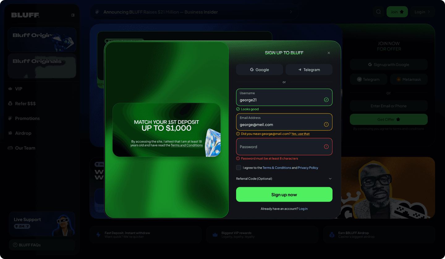
Sign up by Email - Error Recovery
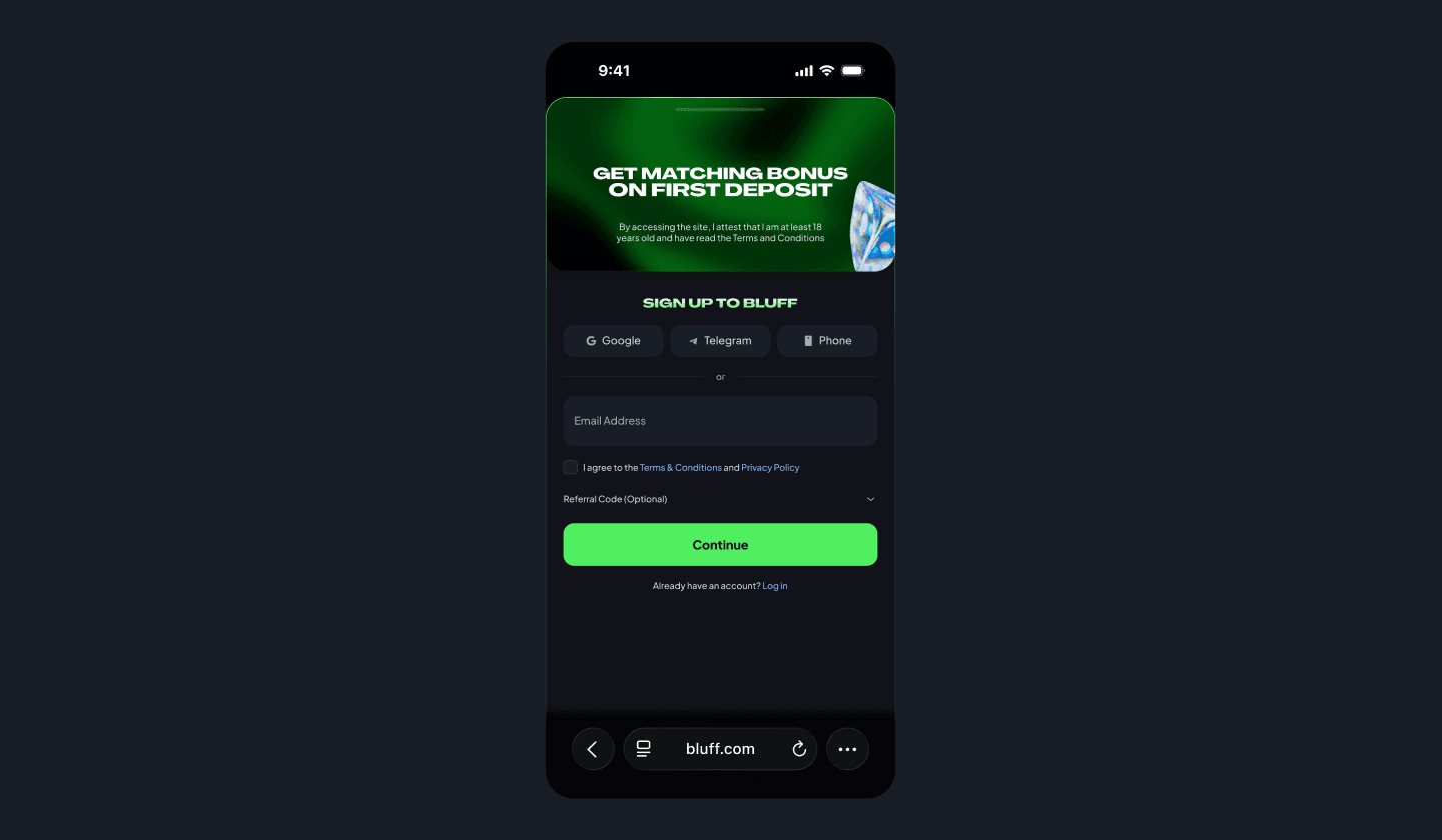
Sign up - Mobile

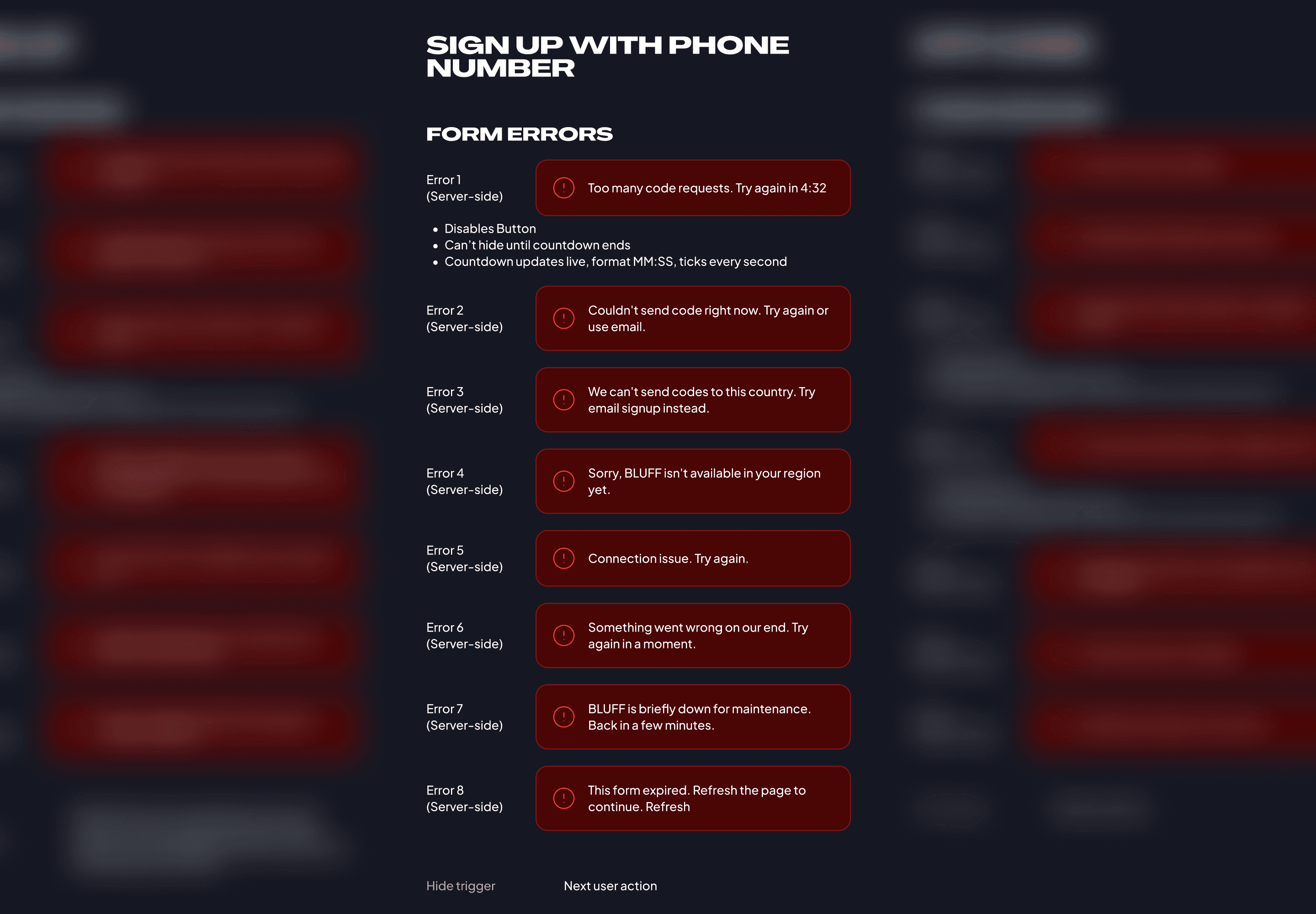
Sign up with Mobile Number

Dynamic states matrix snapshot
Form error states snapshot
Signup started as "copy Shuffle." That was the explicit brief: don't reinvent, match the pattern crypto casino users already trust. The live version shipped on that brief and it's a fine signup, clean, fast, doesn't get in the way.
But "copy Shuffle" is a starting point, not a finishing point. It tells you what to ship for the happy path. It doesn't tell you what happens when SMS delivery fails on a Tuesday at 11pm, when an OTP code expires after the user waited 90 seconds for it, when a country gets restricted at the carrier level instead of the jurisdictional level. The error messaging system is where I actually got to do my job.
I mapped every error state across email signup, phone signup, and OTP verification, more than two dozen distinct conditions in total. Each one sorted by whether the cause was client-side (something the user could fix themselves) or server-side (something they couldn't), and by whether the message should dismiss on retry or persist until the underlying condition cleared. That's not glamorous work. It's the work that decides whether someone successfully signs up or rage-quits to a competitor.
Three decisions ended up doing most of the work:
A "wrong password" message dismisses on retry, the user types it again, the message clears. A "country not supported" message persists, there's no retry that fixes it. Mixing those two behaviors is the difference between an error system that helps and one that gaslights the user. (Plenty of casino signup flows actually do gaslight, by the way. It's a pet peeve.)
1
SMS delivery failure offers email as the fallback. Country-not-supported on phone offers email. Account creation blocked sends to support. Every persistent error has at least one usable next step, because the alternative is a user stuck on your page who's deciding they hate you.
2
Casino traffic skews heavily mobile, and phone signup is the flow where mobile is actually different from desktop, not just a smaller version of it, SMS autofill, numeric keypad, full-page country picker, keyboard-aware submit positioning. I built phone signup as a mobile-native flow first, then designed back to desktop. Doing it the other way around always shows.
3
Click through the prototype below to see the error recovery system in action. The happy path is the boring version of any signup flow, what the system does when things break is the version that matters.
I left the prototype interactive on purpose. Reading about error states is one thing, clicking through one and watching the system recover is another. If you've ever been stuck on a signup page that didn't tell you why you were stuck, you already know the difference.

Roulette
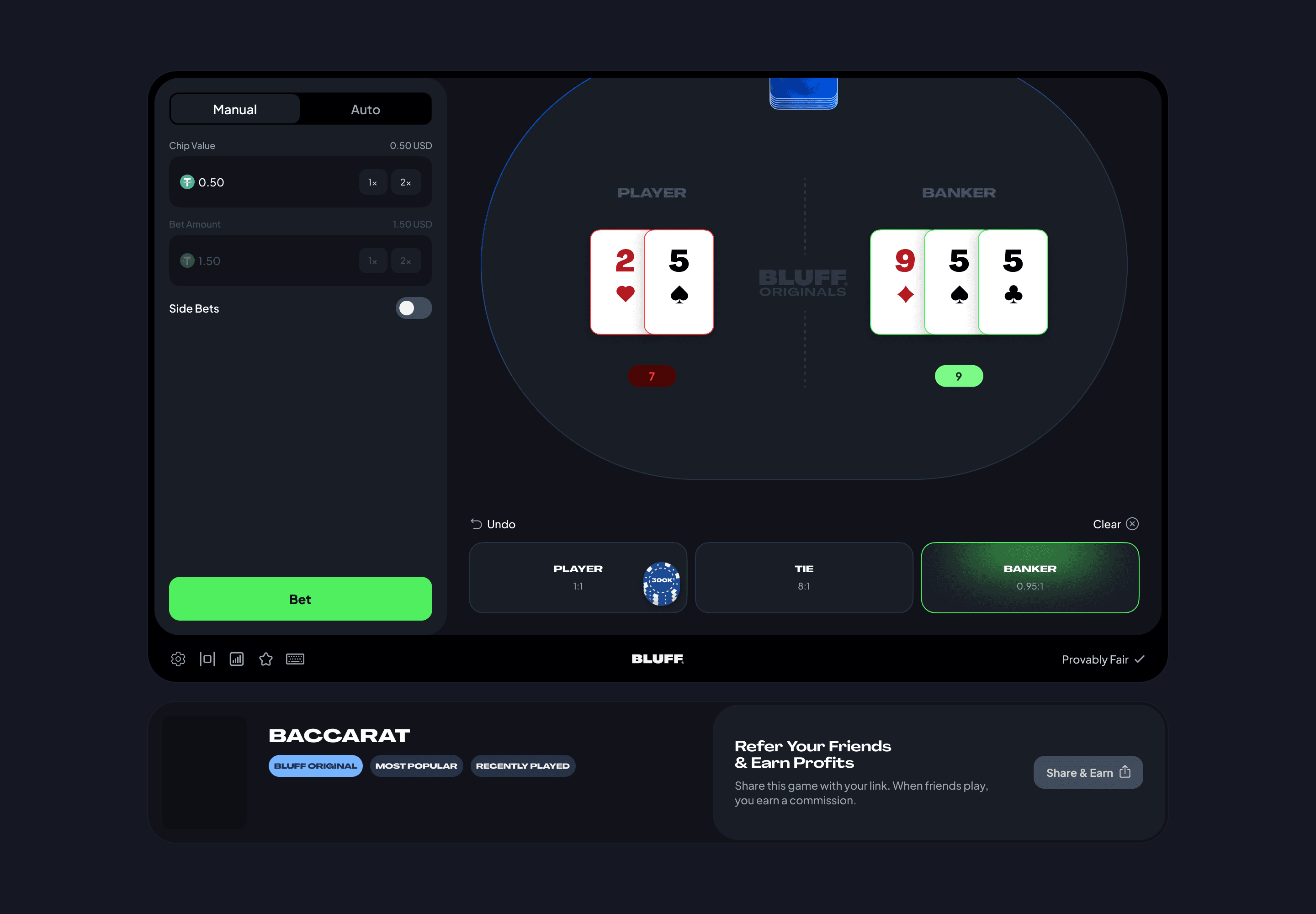
Baccarat
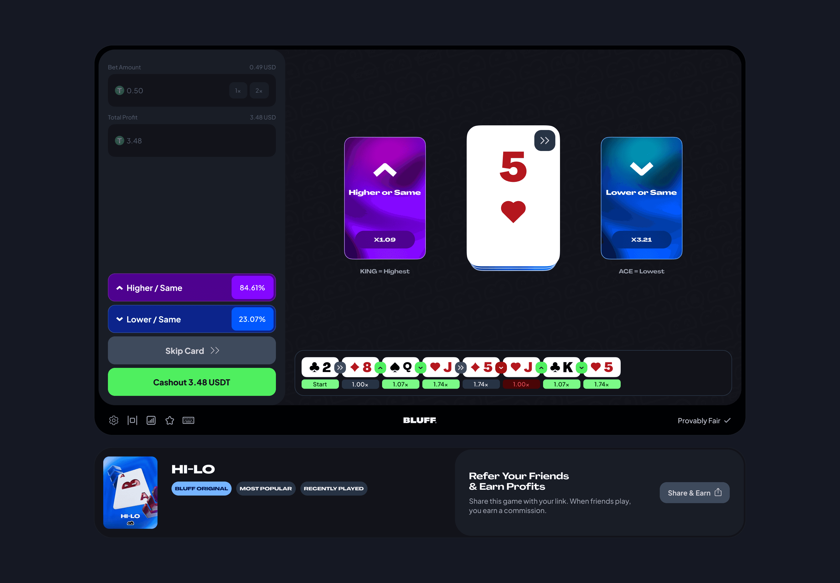
Hi-Lo

Mines
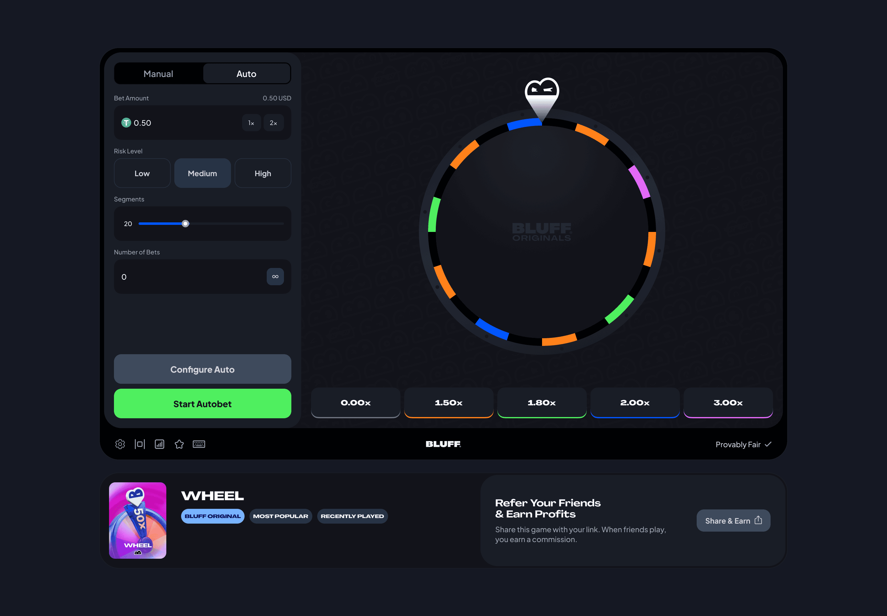
Wheel

Keno

Limbo

Plinko

Dice

Blackjack
Twelve in-house games shipped during my fifteen months: Blackjack, Dice, Plinko, Mines, Limbo, HiLo, Keno, Baccarat, Wheel, Roulette, Crash, and Flappy Fortune. I owned UI on all of them, graphic work on most, and worked directly with developers through Jira and Slack as each one went from Figma to live build.
Eleven of these are well-trodden formats. The work wasn't inventing the game, it was making sure the bet flow, the result state, the autobet panel, and the mid-round controls feel coherent across twelve products that share a sidebar but otherwise live in their own visual worlds. There's a real design challenge in consistency at scale that doesn't kill personality, Roulette doesn't need to look like Plinko, but they shouldn't feel like they were designed by different people either.
The exception is Flappy Fortune.
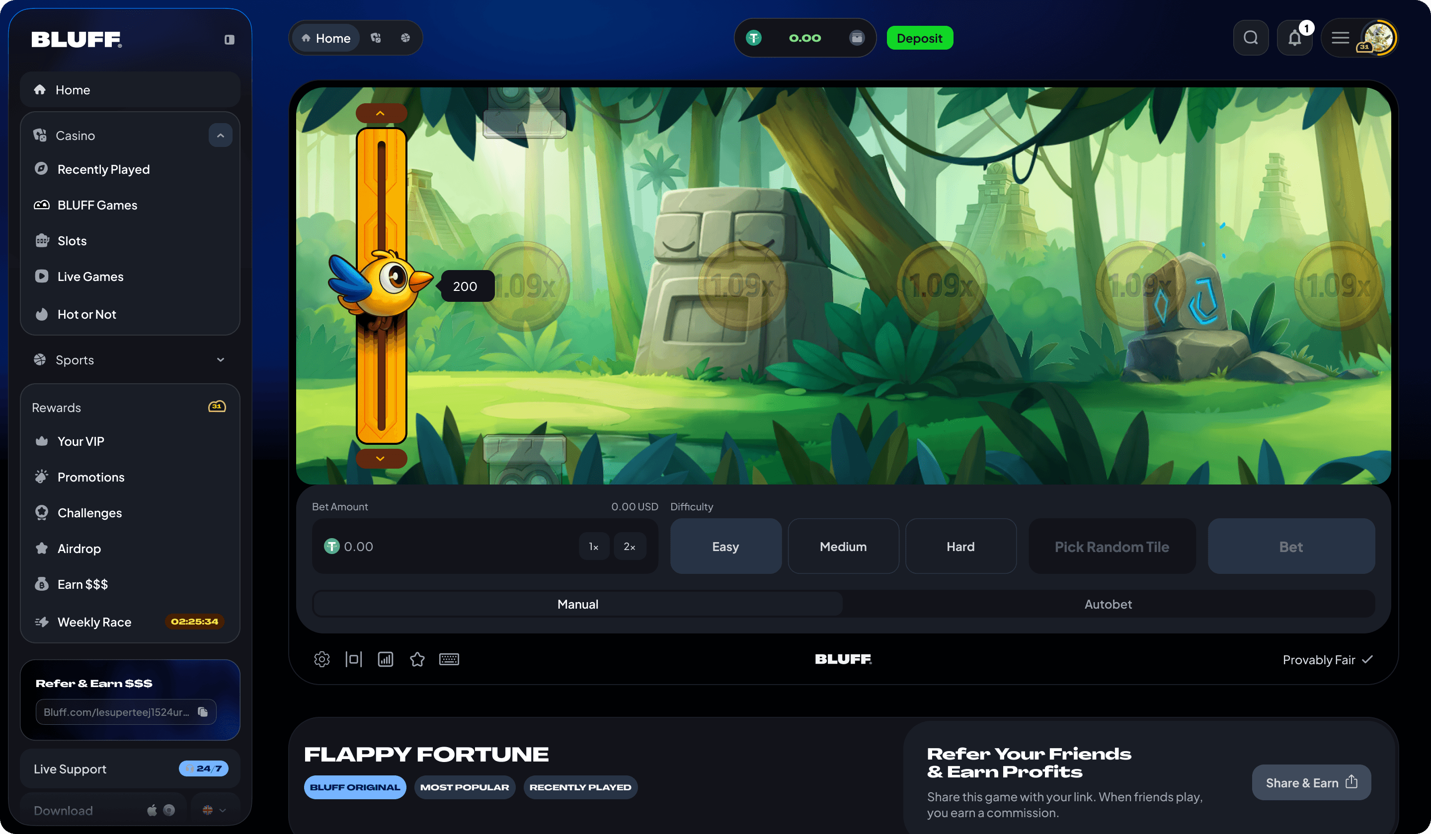
Flappy Fortune - Idle State
Flappy Fortune is a Bluff exclusive. Nobody else has it.
The concept is closest to Chicken Cross, if you've never seen Chicken Cross, it's basically a casino game where you decide each round whether to keep going or cash out, and the multiplier increases each step until you lose. Simple, addictive, well-trodden. Flappy Fortune adds one mechanic that changes the entire design problem: at every step, the player also chooses which lane the bird flies through, not just whether to keep going. That single addition turned a "click to advance" game into a "spatial decision under uncertainty" game, and it forced almost every state to be designed from scratch instead of borrowed from existing patterns.
Here's what I had to figure out, in order of difficulty:
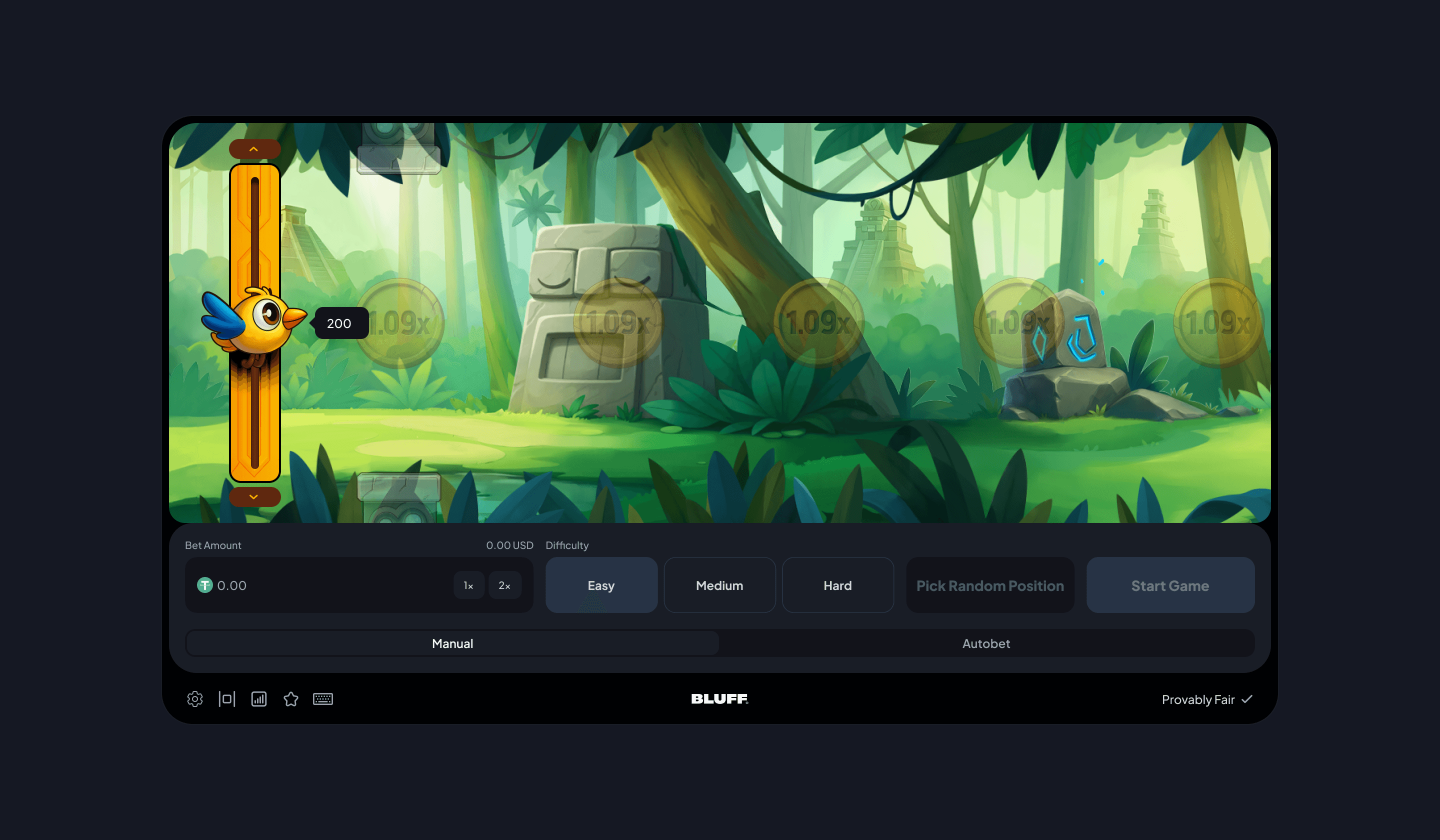
Difficulty selector, lane visibility rules, full bet controls. The point is to communicate "you're choosing a path through obstacles" before the player has placed money. If that mental model doesn't land here, every subsequent state has to fight for it, and you can't fight for a mental model after the player's already losing money.
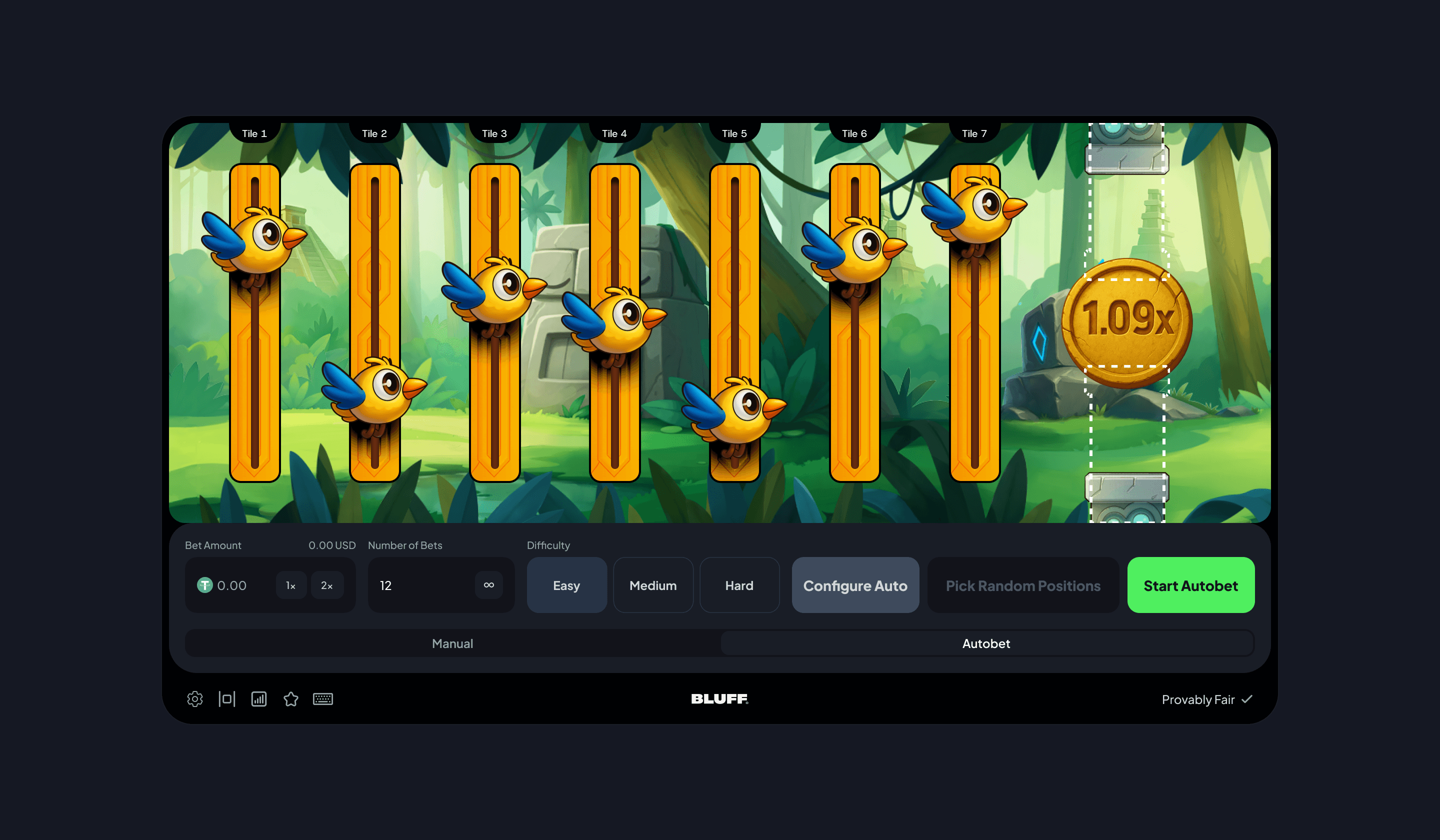
Two completely different control panels. Autobet introduces target multipliers, win/loss reset rules, stop-on-profit and stop-on-loss thresholds, and a tile-by-tile lineup view of the bird's path. The transition between the two had to feel like switching modes inside the same game, not jumping into a different product.
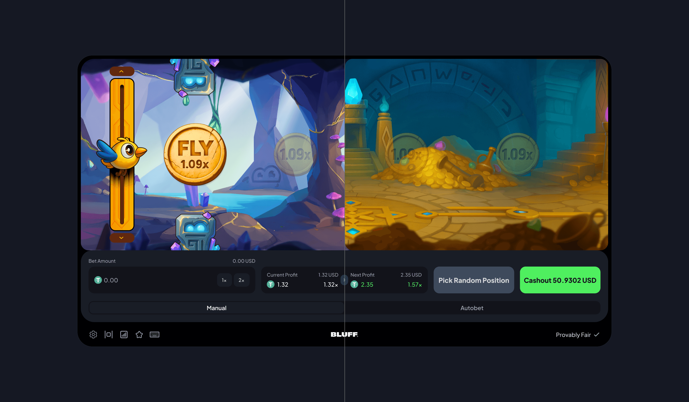
Jungle and purple cave shipped at launch. Different background art, different pillar treatment, different ambient lighting, but identical mechanics. The challenge was making sure the gameplay layer stayed legible across both art directions so a player who learned the game in jungle could play it in cave without re-learning anything.

Portrait orientation, single-column controls, larger touch targets, the autobet panel reorganized vertically. Mobile isn't a smaller version of desktop here, it's a different layout for a different use posture: held in one hand, played in short sessions, with a thumb that's also doing other things half the time.
Dashed outlines indicate where pillars will descend - incoming, not present.
The hardest state was position selection while pillars were descending.
The pillars descend from above mid-round. If you show them as solid blocks before they descend, players read them as permanent walls and freeze. If you show them as nothing, players don't see them coming and feel cheated when they appear. Both options are wrong in different directions.
I shipped the indicator as dashed-line outlines of where the pillars would descend, incoming, not present, which lets players plan their route without misreading the field. The decision came from watching the prototype: the moments where players hesitated were the moments where the pillar state was ambiguous. Dashed lines turned out to be the lightest visual treatment that disambiguated without dominating the screen, and there's a more general principle in there worth keeping, when you're communicating future state, the lightest treatment that works is always the right one. Heavier treatments build up visual debt that you'll pay for in the next state, and the next.

Mid-game UI - current profit, profit-on-next-tile, Cashout primary. Everything else hidden.
Once the bird is moving, the bet controls, lane selectors, and difficulty UI all become visual noise. I hid them and replaced the panel with two numbers: current profit and profit-on-next-tile. Cashout becomes the primary action. Pick Random Position becomes secondary. Everything else gets out of the way.
The principle is that mid-game decisions are different from pre-game decisions. Pre-game, the player is configuring, they need full control. Mid-game, the player is reacting, they need fewer choices and faster feedback. UI density needs to drop the second the round starts, and the controls that survive need to map to the decisions the player is actually making in the moment, not the ones they were making thirty seconds ago.
The single observation I'm proudest of came after the developers had built a working version.
The bird was flying, but on every round, the bird moved to the right edge of the screen first while the environment stayed put. From a player's perspective, the bird was always pinned far-right, racing into a static world. It read as wrong, and I couldn't articulate why for about an hour. I just kept saying "something feels off" to anyone who'd listen.
The fix was a camera change. Instead of moving the bird across a static environment, the environment scrolls past a bird that stays anchored on the left, until the player has crossed enough tiles that the environment runs out and the bird finally moves to the right edge. The mechanic is identical. The feel is completely different, it's a game now, not a sprite test.
That ship landed because of post-build QA, not because of the original spec. Spec coverage is a baseline. Post-build review is where the actually-good products separate from the ships-and-forgets.

Notifications panel - Filled

Empty state.
Bluff's notifications run on the Smartico API. The constraint defined the design: I couldn't ship anything the API didn't deliver, and I also couldn't ship a panel so minimal it felt under-designed for a $21M-backed product. There was a narrow window of "good design that's also actually buildable on this platform" and that's what I was working in.
I read the API documentation end-to-end before drawing anything. (Designers who skip this step always lose two days later, when the developer asks "wait, you wanted what now?") Then I mapped what was deliverable from the platform side and what wasn't, and worked the panel back from there. Categories, promotions, account activity, gameplay events, VIP updates, were the structural choice, because the API surfaced category metadata cleanly and because the alternative (a single chronological feed) loses signal fast at scale.
Visually, I kept it quiet. Casino UIs reach for spectacle by default, flashing badges, animation everywhere, hot CTAs on every card, and notifications are the wrong place for that. A notifications panel that screams trains the user to dismiss it on sight. Bluff's panel reads as calm: clear category labels, single-line copy, soft contrast on read vs. unread, tap targets large enough to act on without precision.
The build went through close coordination with the developer integrating Smartico, daily Slack threads, occasional Meet calls when a state's behavior didn't match what the API was supposed to return. The panel is live on Bluff.

Design System - Figma Parameters & Tokens
The Superduper Design System gave me a starting template. Bluff specifically, twelve in-house games, a sportsbook, a casino home, VIP and rewards surfaces, transaction and bet history, settings, notifications, needed components the template didn't ship with. I built Bluff-specific patterns on top: complex bet input cards, multi-state game control panels, notification cards, VIP status components, and a profit-and-multiplier display pattern that recurs across every game's mid-round UI.
Edge states earned their own design pass for every shipped surface. Empty, loading, partial-data, error, mid-action, success, drawn before handoff, not after. Most casino product UIs collapse the edge state pass into "the engineer will figure it out at runtime." Bluff doesn't, and that's not because of the engineers. It's because I drew the states.
After launch, I ran a continuous post-ship QA tracker in Google Sheets. The workflow was simple: walk the live site (and mobile), log every visual or interaction inconsistency I caught, prioritize, push the fixes to the right developer through Jira. The tracker is the unsexiest deliverable in this entire case study. It's also the difference between a product that ships and a product that holds quality across three months of post-launch iteration. Most companies skip it. The ones that don't, ship better products.
Two takeaways from fifteen months on Bluff:
That was the hardest lesson of fifteen months on Bluff. What survives the next redesign isn't the visual choices, those always change, and they should. What survives is the reasoning: why a state behaves the way it does, why an error persists instead of dismisses, why a control panel hides mid-game. If you only document what you drew, the next designer or the next iteration starts from zero. If you document why you drew it, they build on what you learned.
I know that sounds obvious when you say it like that, but most casino design work treats them as two separate jobs, this is the marketing page, this is the bet flow, this is the Provably Fair modal nobody opens. They're the same problem. If a player doesn't trust what they're seeing, confusing errors, broken edge states, design-by-chaos visual quality, they don't deposit, don't come back, don't refer. Every surface in this case study is a conversion surface, even the ones that look like pure craft. Especially those, actually.
Selected screens. Some of what's shown was designed for ship and is in build at time of writing. No internal documents, no metrics beyond the ones I've explicitly attributed, no unreleased strategy.
Complex product UX and design systems, shipped build‑ready and fast.

